Penrose Tilings
First project
The Penrose tiling has fascinated me since I first saw it in Martin Gardner's January 1977 column in "Scientific American". This article describes a way found by Roger Penrose (an Oxford Professor) to tile a flat area using two simple shapes, but with no overall symmetry.
At first glance, it looks like a random arrangement. After some study,
symmetrical patterns emerge at different scales. As the article points
out, there is a rule that turns a pattern into a larger (or smaller)
scale pattern. What this means is that all patterns are the same if
you look over a large enough area.
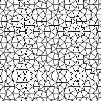
One shortcomming of the article was that there was no picture that
showed a large area of the pattern. I thought that if I could see a
larger portion of the tiling, I could better understand the overall
pattern. (Even though the article points out that there is no overall
pattern).
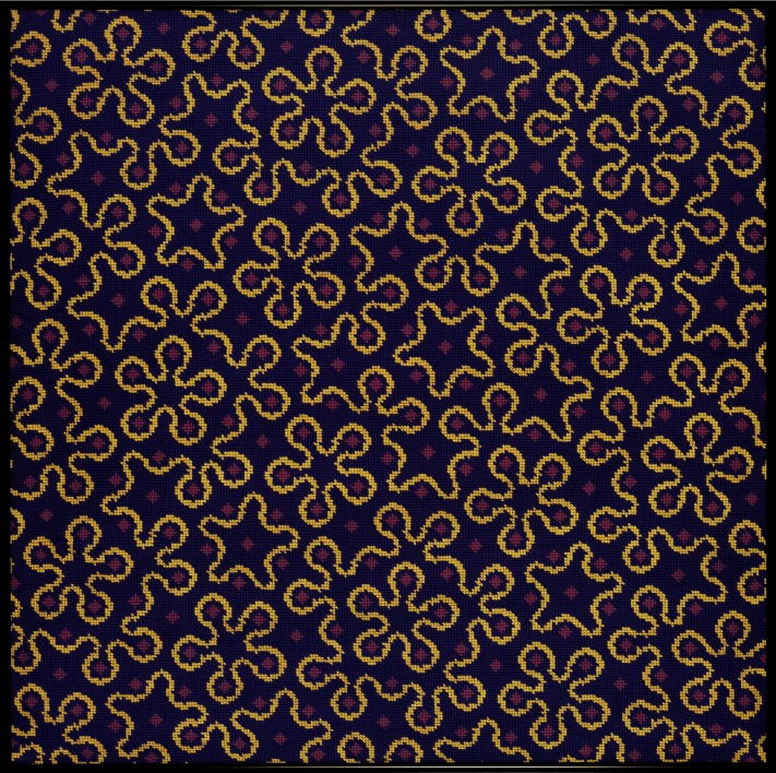
My first Penrose based needlepoint project set out to fill this need.
I generated this view of more tiles.
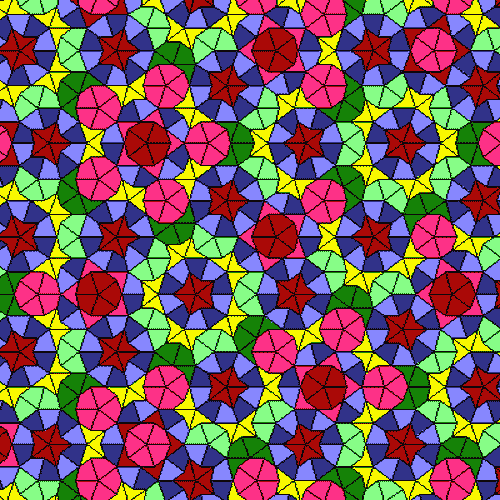
I also did not like the coloring scheme used in the article, as it
seemed to detract from the real patterns latent in this tiling. My
coloring scheme emphasized the partial symmetries. It allowed me to
see what symmetry there was, but also to see where the symmetries
broke down, and bumped up against each other. Here is the design for
my first Penrose project, showing the color scheme I picked.
This shows the ideal design, as first realized on the computer.
Click on the image to see an enlargement.

And here is the actual needlepoint piece. I think this shows that the
limits of needlepoint construction can be overcome in a complex
design.
Second project
My next project was based on a curved line that can be drawn on top of the Kites and Darts.
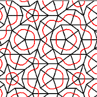
Martin Gardner's article showed two different ways to do this. One is
called the "Red" curve.
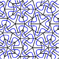
The other is called the "Blue" curve.
I explored both, but to me the blue curve is by far the most
interesting.
My goal then became to show the symmetries, and partial symmetries of this curved line. I wanted to see it on several scales at once. I have never seen any design like it, even though it is in some sense a "fundamental" arrangement, like a honeycomb or grid of squares.
Here is the basis of my second Penrose project.
It ended up looking like
this.
Third project
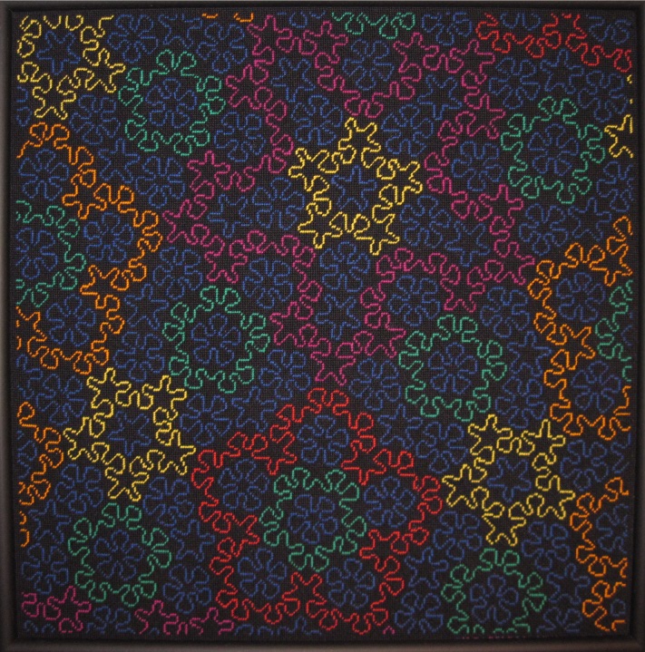 For my third Penrose project, I colored the curved lines, so I could
follow the connections, and closures of the lines. Here one of the
many interesting properties of this pattern needed to be dealt with.
It turns out that the curved lines close up to form an infinite number
of different shapes. What is worse, all of these different shapes
"touch" each of the others somewhere in the design. If you don't want
two different shapes to have the same color, and "touch", you must use
infinitely many different colors.
For my third Penrose project, I colored the curved lines, so I could
follow the connections, and closures of the lines. Here one of the
many interesting properties of this pattern needed to be dealt with.
It turns out that the curved lines close up to form an infinite number
of different shapes. What is worse, all of these different shapes
"touch" each of the others somewhere in the design. If you don't want
two different shapes to have the same color, and "touch", you must use
infinitely many different colors.
Fortunately, I only needed to color in a limited area. I could do that
and worry about the problem of the infinite colors another day. The
project ended up
looking like this
Fourth Project
I was still not satisfied, so I beefed up my computer program and did a fourth Penrose based project, which you can see and read about on the Project: Hortus page.