Project: Hortus
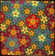
In this project, my goal was to use color to show the various levels of recursion. I chose a set of colors to go with each scale of recursion. I wanted to show as much detail as I could, in order to get in as many recursion scales as possible. I got four levels in this project. The solid coloring emphasizes symmetrical areas. Because the entire tiling has infinitely many levels of recursion, no color scheme like this can work on very large areas. There are not enough colors. But any small chunk can be colored this way.
 Here is a picture of this design in different colors, and at a much
higher resolution than my needlepoint. Click on this image to see an
even
larger version of this image
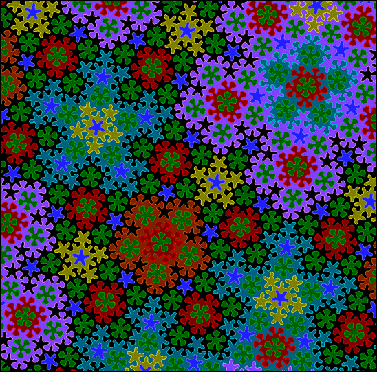
Here is a picture of this design in different colors, and at a much
higher resolution than my needlepoint. Click on this image to see an
even
larger version of this image
I used a lighter color for the edge of each closed curve. The result showed up more symmetries, or relationships than I had seen in the previous linear designs.
This color scheme is interesting to look at even if you do not know anything about the Penrose tiling. It looks sort of like flowers. The frame shop wrote it up as a "floral design".
Although this pattern is just as fundamental as a honeycomb, and has
been known since Rodger Penrose discovered it in the 1970's, I have
never seen it in the popular culture. One reason may be that it is not
easy to draw. Other tilings are easily created by repeating a simple
hexagon, triangle, or square. Nothing can be repeated when drawing
this design or its variants.
In this project, the computer programming phase was especially fun. The challenges were:
- Modeling the Penrose tiling.
- Organizing the curves drawn on top into "objects" of various size.
- Managing the coloring of each object.
- Rendering at different scales.
- Generating the needlepoint chart.
The finished piece:
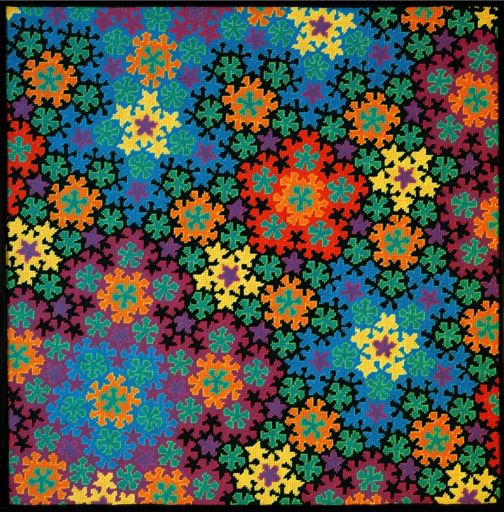
Click the image to see an
enlargement.
See also
This is my fourth project in the Penrose series. Read this article for more information on Penrose curves.